CAP Data Visualization Standards and Best Practices
At the Center for American Progress, we recognize that our standing and influence in the public policy world rests upon a foundation of credibility. Our published work is read widely, scrutinized by peers, partners, supporters, and critics, and therefore must uphold the highest standards of accuracy, transparency, accessibility, and clarity in delivery. Perhaps nowhere in the breadth of our work are these standards more regularly tested than in how we handle data and data visualization. The purpose of this guide is to help strengthen and safeguard the credibility of our data-driven work.
-
Read more… arrow_drop_down
As a data-driven public policy and messaging organization, CAP relies on data visualization to unlock and communicate key findings and insights that contribute to our mission of improving the lives of all Americans. All those who contribute to our data and data visualization work—from researchers to policy team authors to the designers who build the charts, maps, tables, and interactives—must uphold those standards in a consistent and ethical way, and with an eye toward maximum clarity.
What this guide is, and what it’s not
This is not a rigid data visualization rulebook. It is a collection of empirically tested and widely embraced data visualization best practices, adopted as organizational standards, serving six fundamental principles:
- Clarity
- Accuracy
- Transparency
- Accessibility
- Equity
- Efficacy
The standards and best practices in this guide will be applied and upheld understanding that there may occasionally be exceptions that will better serve the higher-order principles. As a living document, it is expected to be regularly reevaluated, refined, and updated. Recommendations for improvement will always be welcome.
How to use this guide
This guide is organized by structural data visualization elements (e.g., axis scales, color, language, etc.) and also data visualization type. In the Resources section you will find a framework for How to choose a chart type that uses nine distinct data story types (which are referred to throughout this guide), as well as a Figure submission checklist.
Authors should have some awareness of the standards and best practices herein and align their requests and expectations accordingly; but they will not be expected to apply every piece of guidance to data and examples submitted to Production prior to publication. The Art and broader Production team will ensure that CAP’s organizational standards and best practices are applied to all published data visualization work and, when necessary, provide guidance to policy team authors on how to bring work into compliance.
If you or your team have any questions or concerns about this guide, or recommendations for improving it, please email dataviz@americanprogress.org.
TL;DR TIPS
Guidance on some of our most common issues.
Figure hed and dek best practices
-
The hed (aka title) should clearly and concisely state the primary takeaway of your visualization. Don’t “hide the ball” or rely on the visualization alone to deliver the finding.
-
A clever title might stimulate interest, but it can also diminish odds of success if it fails to reinforce the message.
-
Unless your target audience is a narrow slice of domain experts, avoid jargon and uncommon acronyms and use plain language.
-
The dek (aka description) should describe the data, basic methodology, and metrics being used in the visualization. State clearly what needs to be understood about the x- and y-axes including units of measurement (e.g., people, jobs, dollars, percentage, or percentage-point change) and parameters of the content (e.g., population, timeframe, criteria). Ambiguity about the premise of the visualization will almost always render it ineffective.
Use of multipliers
-
Data should be delivered to Production (Editorial and Art) in full, actual number values, with as many decimal places as possible, and never using a multiplier like “in thousands” or “in millions.” Designers will abbreviate large numbers and/or adjust the number of decimal places according to CAP standards and best practices (e.g., $4.1B, 13.2M, 275K, 1.65%, or a full big number when appropriate). Read more about submitting figures in the Figure submission checklist section below.
Submitting figures to Production
-
Read more about submitting figure data in the Figure submission checklist section below.
Dual y-axis charts
-
Line charts and bar charts in CAP products should always have one x-axis and one y-axis, as they are based on the x-y Cartesian coordinate system. So-called dual y-axis charts break this foundational principle, making them too easily manipulated by authors and too easily misunderstood by readers.
Truncating the y-axis
-
Never truncate the y (value) axis on a bar or area chart. All quantitative, ratio data scales on bar or area charts must start at zero.
-
The y-axis can be truncated on a line chart. Line charts rely on position, not area or length, to reflect value; therefore, truncating is allowable but only when necessary to clarify — not exaggerate — changes or trends in the data.
CHART TYPES
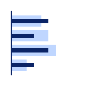
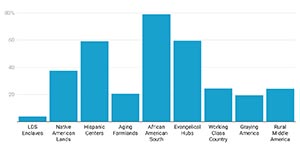
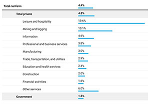
Bar charts
Because of their familiarity, clarity, versatility, and precision, bar charts are the workhorse chart type of the data visualization world. They are a strong option for telling comparison of magnitude stories, change over time stories, part-to-whole stories and ranking stories.
NOTE: Though they are grouped together under a broader category of bar charts, “bar chart” refers to horizontal bar charts, and “column chart” refers to vertical bar charts.
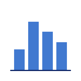 Column chart
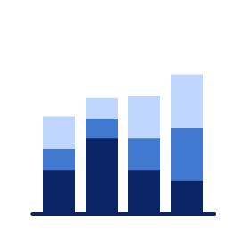 Stacked column chart
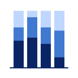 100% stacked
column chart
100% stacked
column chart
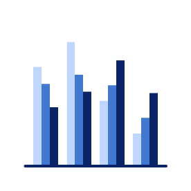 Grouped column chart
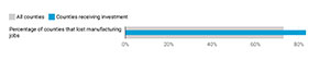
 Bullet chart
 Bar chart
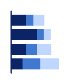 Stacked bar chart
 100% stacked bar chart
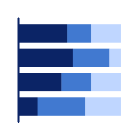
 Grouped bar chart
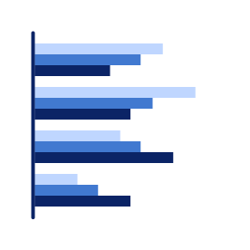
 Split bar chart
Column chart
Stacked column chart
100% stacked
column chart
Grouped column chart
Bullet chart
Bar chart
Stacked bar chart
100% stacked bar chart
Grouped bar chart
Split bar chart
Split bar chart
Column chart
Stacked column chart
100% stacked
column chart
Grouped column chart
Bullet chart
Bar chart
Stacked bar chart
100% stacked bar chart
Grouped bar chart
Split bar chart
CAP standards and best practices for bar charts:
-
Never truncate the y (value) axis on a bar chart. All quantitative, ratio data scales on a bar chart must start at zero.
-
Bar charts (and line charts) in CAP products should always have one x-axis and one y-axis, as they are based on the x-y Cartesian coordinate system. So-called dual y-axis charts break this foundational principle, making them too easily manipulated by the author and too easily misunderstood by the reader.
-
Sort bars in a purposeful way that best serves your audience and goals: chronologically, by descending or ascending values, or alphabetically. Arbitrary sorting is less intuitive and susceptible to bias.
-
In a Stacked bar chart, segments should also be stacked purposefully.
-
Exceptions can be made for a repeating series, when a consistent order or grouping might help readers track charts in a series.
-
-
A quantitative scale is required. Column charts should always use a quantitative scale on the vertical axis. Bar charts should always use a quantitative scale on the horizontal axis.
-
Limit the number of discrete category bars used in (vertical) column charts. If your dataset has six or more categories, or categories that require lengthy labels, you should consider using the (horizontal) bar chart type.
-
Column charts using a time or other interval x-axis scale (e.g., a time series chart) can display a far greater number of bars because they have a continuous scale, which can be labeled with intervals (e.g., 2010, 2015, 2020, etc.).
-
-
Quantitative scales should use consistent, equal intervals, with a range set to comfortably accommodate the data, never to manipulate it.
-
Avoid awkward intervals or excessive interval labeling. Stick with commonly rounded values—enough to provide guidance but not create unnecessary visual noise.
-
-
Use solid colors only. Avoid 3D effects and gradient shading.
-
Logarithmic scales may be used to accommodate an exponential range but should be labeled clearly and conspicuously.
-
Use intuitive positive-negative direction. In a horizontal bar chart, positive values should go right and negative values should go left. In a vertical column chart, positive bars should go up and negative values should go down.
-
Category (class) labels on a column chart should be centered beneath the column and left-aligned on a (horizontal) bar chart; they should not be rotated (see also: Axis scales and labeling section).
-
Column chart labels must be concise in order to fit under bars without rotation. Trim repetitive or redundant label language. If labels must be longer, consider using a (horizontal) bar chart.
-
-
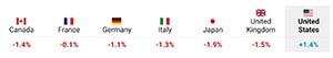
Bullet charts should be used to show progress toward a goal or performance against a reference or benchmark line. The featured bar should use a strong, saturated color, while shading around the bar should always be a lighter shade of the bar color or light gray.
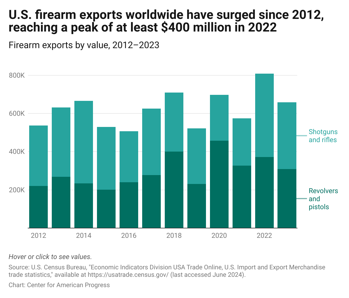
Figure 1 from "At Home or Abroad, U.S. Firearms Should Not Fuel Violence, Instability, and Abuse" (Allison McManus, Laura Kilbury), 7/15/24.
Bar chart inspiration
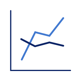
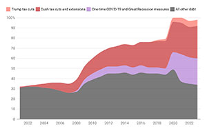
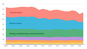
Line charts
Line charts are the go-to chart type for telling change-over-time stories. They typically have a quantitative scale on both axes, with the horizontal x-axis depicting chronological time. Area charts, similar to bar charts, show the aggregate value and the proportion of each component part, distinguished by color, over time.
 Line chart
 Area chart
 Stacked area chart
 100% stacked
area chart
100% stacked
area chart
 Range area chart
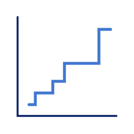 Stepped line chart
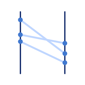 Slope chart
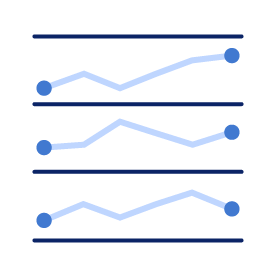 Sparklines
Line chart
Area chart
Stacked area chart
100% stacked
area chart
Range area chart
Stepped line chart
Slope chart
Sparklines
Sparklines
Line chart
Area chart
Stacked area chart
100% stacked
area chart
Range area chart
Stepped line chart
Slope chart
Sparklines
CAP standards and best practices for line charts:
-
The y-axis should have a quantitative value, and the x-axis should be a time scale or sequence of intervals.
-
When more than 5–7 lines (series) are being displayed, consider using measures to reduce clutter, such as deemphasizing secondary lines by making them light gray. Tooltips (rather than a color key) can help the reader identify the deemphasized (gray) line series.
-
Line charts should only use linear interpolation. Curving or smoothing can distort or misrepresent the data.
-
A stepped line can be used to show a value that changes only periodically and abruptly (e.g., changes to the federal minimum wage).
-
-
Direct labeling of lines should always be considered. Color keys require back-and-forth eye tracking, making the chart more difficult to read and burdening the reader with a heavier cognitive load.
-
Color keys can be used when lines are too tightly grouped to direct label when the chart is part of a series with a common scale, or when there is a simple (one- or two-color) chart that does not require back-and-forth eye tracking to follow.
-
Simple (one- or two-color) color keys can be integrated into the chart hed or dek (title or subtitle) by coloring or highlighting the relevant text to match the line color.
-
-
Time series charts must always use a chronological scale on the horizontal axis, with time running from left to right.
-
X-axis tick labels should be centered on the tick mark and should not be rotated. If there is an issue with fit, labels should be periodic at regular intervals.
-
-
Quantitative scales should use consistent, equal intervals, with a range set to comfortably accommodate the data, never to manipulate it.
-
Avoid awkward intervals or excessive interval labeling. Stick with commonly rounded values—enough to provide guidance but not create unnecessary visual noise.
-
-
The y-axis can be truncated on a line chart, unlike a bar chart. Line charts rely on position (not area or length) to reflect value; therefore truncating is allowable, but only when necessary to clarify—not exaggerate—changes or trends in the data.
-
The y-axis should not be truncated on an area chart because it reduces the visible area that is representative of the value.
-
-
Line charts (and bar charts) in CAP products should always have one x-axis and one y-axis, as they are based on the x-y Cartesian coordinate system. So-called dual y-axis charts break this foundational principle, making them too easily manipulated by the author and too easily misunderstood by the reader.
-
Logarithmic scales may be used to accommodate an exponential range but should be called out clearly and conspicuously.
-
Markers (dots) can be used on line charts to indicate the points of observation and places where data may be missing —except in cases where the volume of observations might cause markers to clutter the chart
-
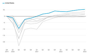
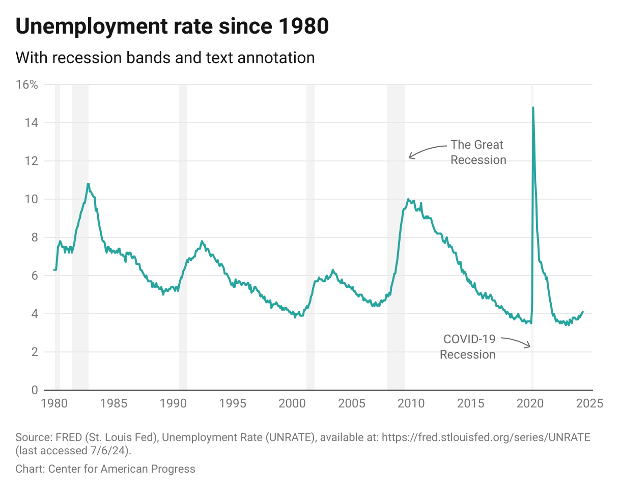
line charts depicting economic or financial data should include recession bands for orientation and context.
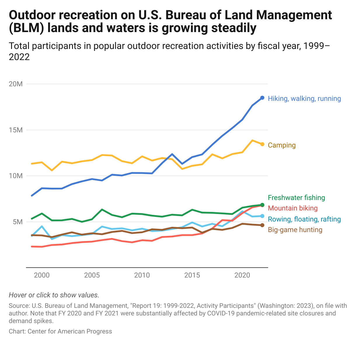
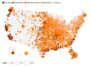
Figure 1 from "Protecting Vulnerable Public Lands Could Address U.S. Outdoor Recreation Needs" (Drew McConville, Sam Zeno), 9/20/23.
Line chart inspiration
-
More about line charts… arrow_drop_down
Though time is a continuous scale, line chart lines are made by connecting points at which observations were made (e.g., daily, monthly, annually).
There are several variations of the line and area chart:
- The slope chart (aka slope graph) is an abbreviated line chart, showing only a start and end point connected by a straight line, allowing the reader to quickly see whether a value increased or decreased over time, and how steeply. This simplification also allows for a greater number of series to be included without overwhelming the reader.
- A bump chart shows ordinal ranks, like shifting sports team standings or college rankings, rather than traditional number values.
- Sparklines are highly simplified and miniaturized line charts with no visible axes or tick labels, designed to offer an at-a-glance view of how values are trending. They are often used in a series to provide comparisons, contrasts, and context as part of a dashboard or compilation of information (e.g. in tooltips, as a chart insert, or in a table).
- A streamgraph is like a stacked area chart but with algorithmic line smoothing and no baseline. As a relatively new and exotic chart form, it is eye-catching but best used when trying to provide an imprecise feel for trends over time.
Dot plots
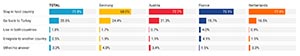
Dot plots compare points along a (typically horizontal) scale to illustrate difference, direction, or distribution. Gap charts (aka range plots) are useful for focusing attention on the difference between two values, rather than comparing their size, as you might with a grouped bar chart. Arrow plots can emphasize positive or negative change in value. Dot plots or Bubble plots are useful for showing a distribution of data along a spectrum while sometimes adding another dimension (bubble size).
 Gap chart
 Dot plot or Bubble plot
Gap chart
Dot plot or Bubble plot
Dot plot or Bubble plot
Gap chart
Dot plot or Bubble plot
CAP standards and best practices for dot plots:
-
When making gap charts …
-
Direct label the first series, when possible.
-
Use contrasting dot colors—ideally warm and cool—to make a clear distinction between categories being compared.
-
Label dots in the way that best serves the data story, using dot values, difference value, or percent change.
-
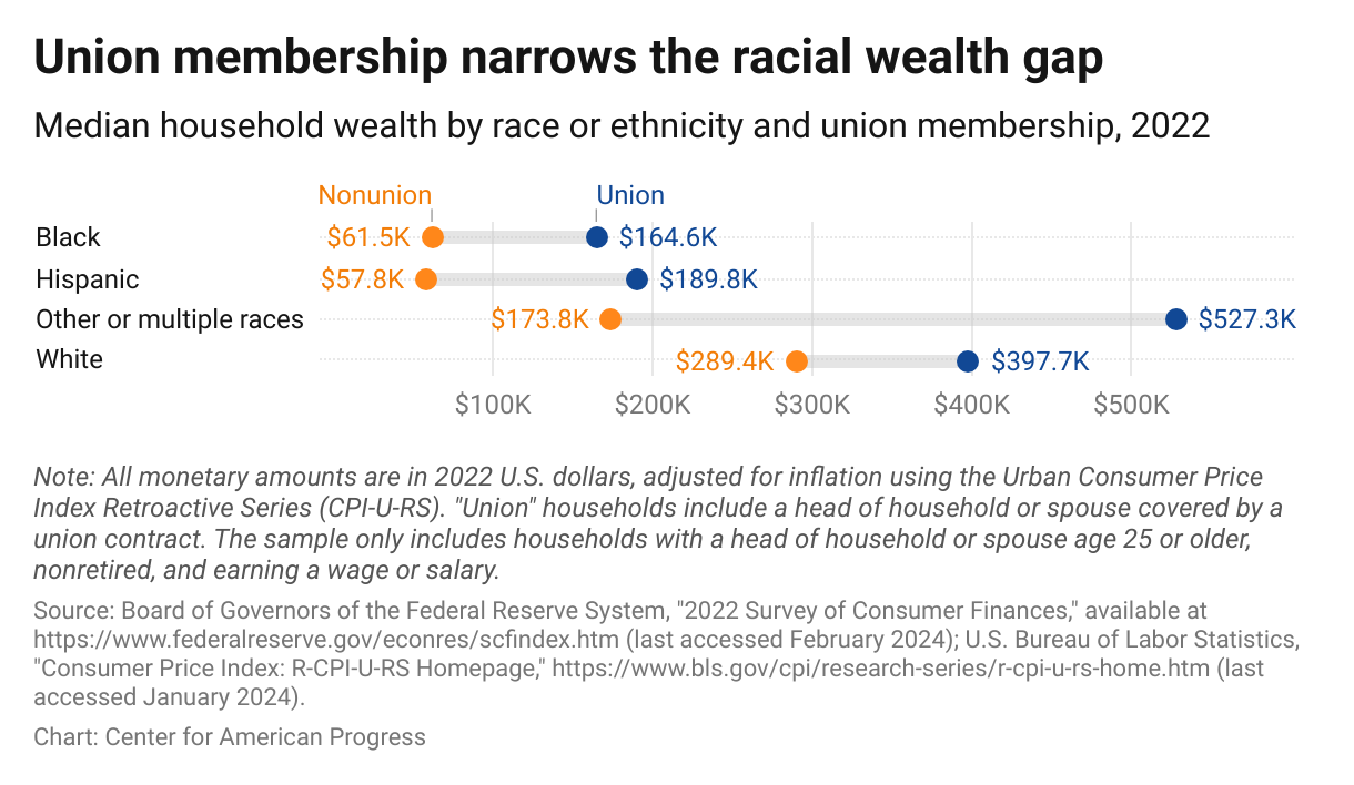
Figure 2 from "Unions Continue To Build Wealth for All Americans" (David Madland, Christian Weller, Sachin Shiva), 3/20/24.
Dot plot inspiration
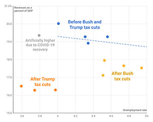
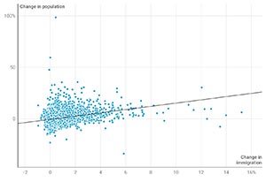
Scatterplots
Scatterplots are the gold standard for visualizing a correlation story and are uniquely versatile for graphing multivariate data.
 Scatterplot
 Bubble chart
Scatterplot
Bubble chart
Bubble chart
Scatterplot
Bubble chart
CAP standards and best practices for Scatterplots:
-
A Scatterplot must have at least two quantitative variables to plot on the x- and y-axes .
-
Proportional symbols (eg., bubbles) can be used in a Scatterplot to add an additional variable encoded by proportional area (size) of each symbol (e.g., circle/bubble or square).
-
Color can also be used to add a variable, typically to identify categories.
-
Proportional symbols (e.g., circles/bubbles) should use a low-opacity fill and a fine and 100% opaque white or fill color stroke, for readability of clustered, overlapping shapes.
-
-
To avoid clutter and preserve readability, a limited number of data points should be given static labels. Scatterplots with more than 10 data points should be selectively labeled, and/or use tooltips in live interactive charts for identification.
-
Trendlines (aka lines of best fit) must be calculated using traditional local regression methods such as LOESS or LOWESS .
-
Annotations, reference lines, and baselines (e.g., mean or median value), or labeled quadrants, are encouraged as a means of curating the data story for the reader.
-
Reference lines should be treated as contextual, deemphasized using gray and dashed line styles to avoid creating clutter and visual competition with foreground elements (data points).
-
-
Logarithmic scales may be used to accommodate an exponential range but should be called out clearly and conspicuously.
-
Quantitative scales should use consistent, equal intervals, with a range set to comfortably accommodate the data, never to manipulate it.
-
Avoid awkward intervals or excessive interval labeling, Stick with commonly rounded values—enough to provide guidance but not create unnecessary visual noise.
-
Scatterplot inspiration
-
More about Scatterplots… arrow_drop_down
You can tell a correlation story by simply plotting x-axis values against y-axis values, but a third variable can be added by making dot coordinates into proportional symbols (e.g., bubbles), and a fourth by using color to group symbols into categories. And if the x- and y-axis values are associated with time intervals, you can add a time dimension by connecting the dots (connected scatterplot).
Scatterplots can also be annotated or curated to help the reader better understand the significance of positional values. They can be divided into quadrants (delineated by zero, mean, or median values) or be given diagonal baselines against which to measure the data points. They can also be given a trendline (aka line of best fit) to help the reader see an otherwise invisible trend.
Though scatterplots are not as common or familiar as bar, line, or pie charts, with proper design and curation, they can tell a powerful multivariate story to a broad audience.
Pie charts
Pie charts have been overused and used inappropriately, often stretched beyond their useful capacity. But when used with an appropriate dataset and executed with care, pie (and donut) charts can be an effective tool for depicting percentage distributions and small-scale part-to-whole data stories.
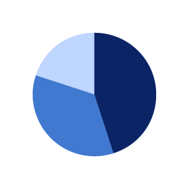 Pie chart
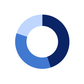 Donut chart
Pie chart
Donut chart
Donut chart
Pie chart
Donut chart
CAP standards and best practices for pie charts:
-
Do not overload a pie or donut chart with too many slices. Seven is often cited as a number not to exceed.
-
Consolidate smaller values into an “other” category, when possible—which can be itemized in a note below, if necessary.
-
-
Direct label slices when possible (inside and/or outside, with leader lines, if necessary).
-
Avoid the “beach ball effect” by using a single color or shades of a single color (with a white stroke) unless values are entirely discrete.
-
When more than seven slices must be displayed, try to group and color by categories, rather than by slice.
-
When the focus is on one slice, use one color for all other slices (typically a cool color, such as blue or gray) and highlight the slice being referenced in a contrasting (typically warm) color, such as red, gold, or orange.
-
-
Direct label when possible (inside and/or outside).
-
Do not separate or “explode out” a slice for the purpose of highlighting. Instead, use contrasting colors: a warm, bright color for the highlighted slice and a cooler, dimmer color for the remaining slices.
-
Use solid colors only. Avoid 3D effects and gradient shading.
-
Organize slices in order of descending value from 12 o’clock (top-center), with “other” and/or “N/A” category last—even if it’s larger than the smallest individual slice.
-
An acceptable alternative sorting places the second-largest slice last so it appears at the top of the Chart alongside the largest slice.
-
-
Percentage values should always add up to 100%. When rounding results in a total slightly greater or lesser than 100%, a note should be included below.
-
Donut charts can be considered as an alternative when three or fewer values are required.
-
Highlighted value or higher-order category (e.g., state) can be placed in the center but generally not explanatory text.
-
-
Consider whether a bar chart, a stacked bar chart, or a treemap would better serve your audience and goals.
-
When direct comparisons of magnitude are important, consider using a conventional stacked or grouped bar chart.
-
When there are too many values and/or the data have a hierarchical order, consider using a treemap.
-
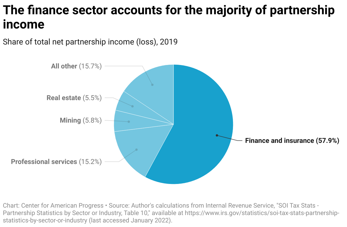
Figure 5 from "The Millionaire Surcharge Would Improve the Fairness of the Tax Code" (Jean Ross, Seth Hanlon), 6/8/22.
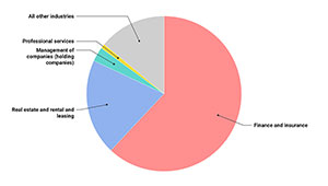
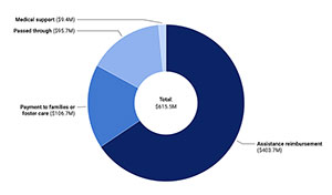
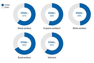
Pie chart inspiration
Other charts
There are many other less-common chart types that might be better suited to a particular data story than the common options listed above.
 Treemap
 Sankey chart
 Alluvial chart
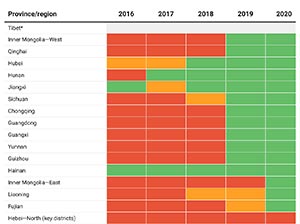
 Heatmap
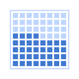 Waffle chart
 Timeline
Treemap
Sankey chart
Alluvial chart
Heatmap
Waffle chart
Timeline
Timeline
Treemap
Sankey chart
Alluvial chart
Heatmap
Waffle chart
Timeline
CAP standards and best practices for other chart types:
Treemaps are well-suited to tell part-to-whole and comparison of magnitude data stories in a hierarchical structure and a constrained space. Treemaps can more clearly display a greater number of values and categories than other more common chart types, such as pie and stacked bar charts, and network diagrams.
-
Treemaps containing a large number of nested rectangles should not be overlabeled. Smaller rectangles can be identified with tooltip labels.
-
Color, along with labeling, can be used to help the reader distinguish top-level categories and should remain consistent within subcategories.
-
Filtering is recommended as an option for reader exploration.
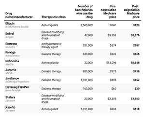
Figure 1 from "Following the Money: Untangling U.S. Prescription Drug Financing" (Sam Hughes, Nicole Rapfogel), 10/12/23.
Sankey Charts are a strong option for demonstrating flow of data from one location or state to others, using the thickness of bands or arrows to reflect value size or proportion.
Alluvial charts are useful for showing the proportion of values across multiple categories, represented as bands of proportional width connected to nodes.
Timelines are a strong option for telling time-based stories when event detail and chronology is important.
-
Sort and filter controls and expand-collapse accordion buttons are recommended for larger, more detailed timelines—particularly those that have hierarchical structure.
Heatmaps can be used to show patterns (e.g., change over time) in large, multivariate datasets by representing values in a grid using a choropleth color scale.
Waffle Charts can be used to tell part-to-whole stories by visualizing fractional or percentage values.
Other charts inspiration
Maps
Maps can be a powerful tool for telling cartographic or geospatial data stories. The familiarity of state and country shapes can quickly engage and orient the reader and clearly illuminate geographic trends. But maps are not always the best option for displaying some geographically organized data (e.g., state- or county-level data) due to some inherent liabilities.
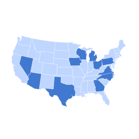 Choropleth map
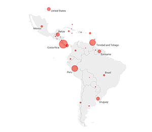
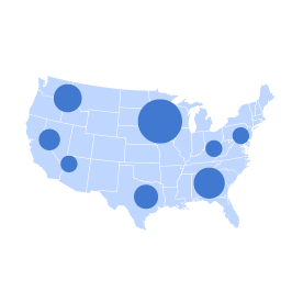 Proportional symbol map
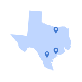 Location map
 Tilegrid cartogram
Choropleth map
Proportional symbol map
Location map
Tilegrid cartogram
Tilegrid cartogram
Choropleth map
Proportional symbol map
Location map
Tilegrid cartogram
CAP standards and best practices for maps:
-
Maps should be used when physical geography (e.g., land area) or geographic trends are integral to the story.
-
When geography and geographic trends are not integral to the story, consider a cartogram (such as a tile grid or a hex map) to display state-level data in a more balanced way, or an entirely different (nonmap) chart type that’s better suited to the data story you’re telling.
-
When using cartograms, label shapes and groups, as they’re not recognizable by shape or relative position. If using abbreviated labels (two-character state postal codes are acceptable), provide redundant full-name labels in tooltips, if possible.
-
-
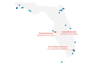
Maps containing specific locations must include latitude and longitude coordinates in the data provided—each in their own column.
-
Tooltips are small callouts that appear when the reader hovers over designated areas of the map.
-
They should be used to identify geographic location (state, county, district, etc.).
-
They should be used to provide additional relevant detail.
-
They should not be overloaded with information. Include only the most relevant information, concisely enough to avoid any need to scroll.
They can be used to display thumbnail images or small multiple charts.
Tooltip values can be added to the figure spreadsheet as independent columns or highlighted for the designer.
-
-
National maps can make for problematic interactive user interfaces due to the vast difference in size between large and small state “buttons” (e.g., Texas vs. Rhode Island or D.C.). Cartograms or traditional web user interface components (e.g., dropdown menus, button grids, etc.), are often stronger UX options.
-
Smaller states, territories, and/or the District or Columbia can be broken out in a key to the right of the East Coast for greater visibility, clarity of coding, and/or ease of selection.
-
-
Isolated 50-state U.S. maps should have Alaska and Hawaii represented below the southeast border, for space efficiency. U.S. territories can also be represented within that framing, out of their natural geographic location.
-
Decisions regarding level of geographic resolution (e.g., state, county, ZIP code) and color scale can have a profound impact on the clarity and readability of a choropleth map, so choose and refine with care.
-
Color scales for choropleth maps, symbol maps, and heatmaps typically use dark-to-light ranges of color (aka color ramps) to indicate volume or concentration of value (e.g., dark blue for higher values, light blue for lower values) using a stepped (classed) or continuous (unclassed) scale. Divergent scales using two or more colors can create a greater range and a stronger contrast in values but should only be used when there is a clear dichotomy (e.g., positive/negative values or another established threshold).
-
If your data are classed (divided into distinct values or ranges) your color scale should be classed (shown in color steps) using discrete color values, either on a gradient scale (e.g., dark blue, medium blue, light blue, etc.) or using distinct, discrete colors (e.g. blue, green, red, purple, etc.).
-
If your data is unclassed (on a continuous scale) use a continuous color gradient, or you can convert your scale into discrete ranges (e.g., 1–10%, 10–20%, 20–30%, etc.) represented by discrete colors from a gradient scale.
-
Use a classed scale when trying to isolate a significant range or communicate statistical brackets. Use an unclassed scale to tell a more fluid, nuanced data story.
-
This Datawrapper blog article explains When to use classed and when to use unclassed color scales.
-
-
The type of interpolation you choose will determine how your data is mapped to your color scale and can have a profound impact on the appearance, clarity, and accuracy of your map and your story.
-
Choose a color interpolation method based on the distribution of your data. Linear interpolation may produce the clearest representation of evenly distributed data, whereas quantile, quintile, or natural interpolation may be better for data with a more skewed distribution and/or strong outliers.
-
When comparing two or more maps, always apply the same color scale and interpolation.
-
This Datawrapper blog article explains How to choose an interpolation for your color scale.
-
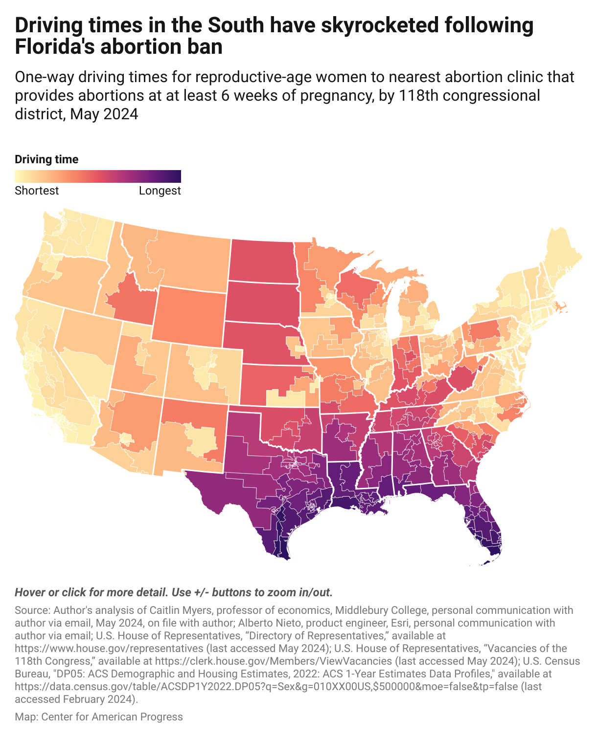
From "Abortion Access Mapped by Congressional District: 6-Week Abortion Ban Update" (Sara Estep), 6/20/24.
Map inspiration
-
More about maps… arrow_drop_down
It’s common for policy-related data in the United States to be aggregated into regions, such as states, counties, congressional districts, census tracts, and ZIP codes. And in instances when geography is relevant, such as when discussing public lands, or when geographic trends are critical to the story, it can be useful for the reader to see the geographical distribution of the data using those designations. But when people or human activity are the logical focus of the story (e.g., showing affected populations or voting and elections), it’s important to understand and remember that maps—particularly choropleth maps—tend to overrepresent landmass and obscure human populations.
A common problem with choropleth maps is that large, low-population-density states such as Wyoming (pop. 579K), command much more visual weight than smaller, more densely populated coastal states, such as New Jersey (pop. 8.9M).
A stark example of this phenomenon is the 2016 presidential electoral map, where the winner of states representing 80% of the landmass lost the popular vote by nearly 3 million votes.
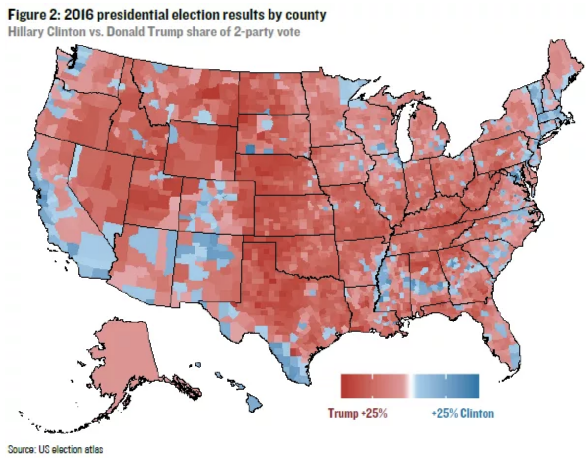
Some of these issues can be mitigated or eliminated by choosing the appropriate type of map, but in many instances, the data can be more effectively displayed using a different chart type.
Some types of maps:
- Choropleth maps are by far the most common type of map in data visualization. Choropleth maps color-code geographic regions based on data values.
- Area-class maps are a type of choropleth that uses nominal (qualitative) data to display unique areas, such as animal habitats or national parks.
- Tile-grid and hex-map cartograms can be used to display quantitative or qualitative data while correcting for landmass bias.
- Dot density maps can show dots on a map as individual or grouped observations, indicating areas of lesser or greater density of observations.
- Proportional symbol maps, also known as bubble maps, typically use circles/bubbles sized to represent the volume of a variable in a number of locations on a base map.
- Flow maps use lines, often with arrows, to indicate the flow of goods or people from one place to another. Line thickness is coded to indicate volume and arrows can be used to indicate direction.
- Contour maps, also known as isoline, isarithm, or isopleth maps use interpolated data to create interconnected layers of data values. They can be used to indicate regional temperature ranges (isotherm) on weather maps or travel times (isochrone) on commuting time maps.
- Map Diagrams, or topological maps, often exist as transit maps and use abstraction to help readers clearly see and orient a network of nodes (e.g., subway map).
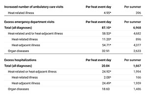
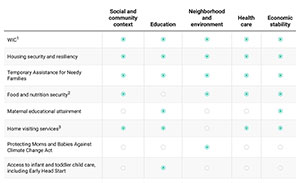
Tables
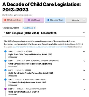
Tables are often the most effective way to present small, quantitative, or loosely related qualitative, datasets in an organized way. Tables should have clear and concise column header labels and/or first-column row headers. They can be tiered for easier readability or contain visual elements like bars (for quantitative values) or dots in a feature grid arrangement.
 Table
Table
 Tiered table
 Table with bars
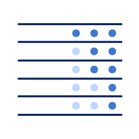 Feature grid
Table
Tiered table
Table with bars
Feature grid
Feature grid
Table
Tiered table
Table with bars
Feature grid
CAP standards and best practices for using tables:
-
Tables should be mobile-friendly. If a table is more than three columns wide, the first column should be made “sticky” to allow for easier tracking while horizontally scrolling.
-
Less vital columns can be designated to be hidden in mobile view.
-
Alternatively, a mobile-friendly “mobile fallback” strategy can be used (e.g., a card-style display, which the Art team can help with)
-
-
Table column headers must be brief—ideally no more than 5 words—and may use common abbreviations to reduce visual noise and improve readability (e.g., “%” in place of “percentage” or “FBI” in place of “Federal Bureau of Investigation”).
-
Acronyms that are not universally familiar (e.g., “CFPB” or “EPOP”) should be spelled-out in the figure dek or in a note below.
-
Table column headers can be made clickable to sort the table by the column contents.
-
-
Zebra striping (i.e., shading alternating rows) should only be applied to tables that have five or more consecutive body rows to help readers track values across multiple columns.
-
Zebra striping should always be done in a light shade of gray (no color) with a text-to-background contrast ratio of no more than 3:1.
-
Striping should not be applied when shading is being used on rows and/or columns for other purposes (e.g., to highlight rows using color).
-
-
Missing values should be represented as “N/A” or with an em dash, as appropriate.
-
Avoid excessively long tables. Table length should not exceed 55 visible rows (e.g., 50-state tables). Longer tables can be displayed with pagination and should be made searchable.
-
Tables with many columns or substantial content can be formatted in a medium-wide (1010 px) or wide format.
-
-
To share a larger dataset within a web-based product, create a downloadable spreadsheet. Larger datasets can be offered as a CAP-authorized downloadable Excel file or Google Sheets link.
-
Avoid text-heavy content. Tables containing paragraphs of text should be reconsidered as sectioned text or bulleted lists in a text box.
-
Content alignment in tables:
-
Number values can be represented as bars or as a heatmap in tables.
-
Icons or images (e.g., country flags) can be added to tables but only if they add value as visual cues.
-
Visual markers (e.g., filled/unfilled dots, check and X marks) can be used to create a feature grid style table.
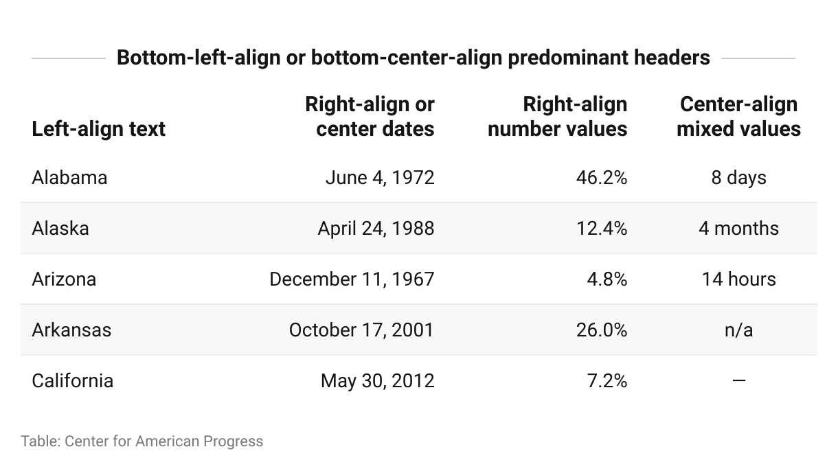
Table inspiration
-
More about tables… arrow_drop_down
Tables present data in a two-axis matrix and are often represented in the form of spreadsheets.
Tables can be an effective tool for presenting disparate or multivariate quantitative data, or qualitative data that doesn’t easily lend itself to a visual chart type. A table may also be the right choice when quick and easy access to specific data values in a broad dataset may be important or useful to your target audience (e.g. 50-state data).
It’s important to consider that tables can create barriers for readers. The narrative thread can be obscured or broken when large tables with broad data ranges appear within the body of a report, rather than targeted data stories.
In some cases, authors can to provide large-table datasets to readers as appendix materials. Best practice in these instances is to provide the reader an Excel file download or Google Sheets link. Authors also have the option of including an abbreviated table in the web version with a link to “Download the full dataset.”
INTERACTIVITY
Virtually all of the charts, maps, and tables we publish at CAP now offer some level of interactivity, from tooltips to sort/filter options to animation. As dataviz tools have evolved, the predominant use of the term “interactive” has shifted from noun to adjective as readers have come to expect more engagement from even the most basic charts. The public appetite for large, complex, deep-dive interactives has waned in favor of less cumbersome engagement—more scroll and hover, less click.
Interactivity must be used judiciously, always weighing reader effort against reader value.
CAP standards and best practices for interactivity:
-
When values or labels are not static (i.e., always present), that information should be provided to the reader via tooltips (aka small callouts that appear when points or areas of the visualization are hovered over or selected via touch or click).
-
Additional contextual information can be included in tooltips, as long as it’s relevant and does not overload the tooltip container.
-
When individual values are less important than an overall shape or trend, and/or values cannot be accommodated due to space constraints, the decision can be made not to display values, static or on hover.
-
-
Many Datawrapper charts allow readers to isolate categories by hovering over or selecting lines, bars, or color/symbol key items. This is useful when elements are intermingled and hard to otherwise distinguish, such as in multiline charts and scatterplots.
-
Tabs or toggle buttons can be used to compare or contrast deeply connected charts or maps, but readers often fail to click, so be sure to make the most important chart the default selection or opt for a two-up or three-up side-by-side presentation.
-
Some sorting and filtering options are available in common charts and maps, but often those features require custom building.
-
Stepped, multichart data stories can feature a series of charts or maps, but there must be sufficient value to the reader in each click in order to justify this approach.
-
Custom-built interactives requiring more focused user engagement are more time- and resource-intense than common figures and therefore may require consultation with Art and Digital Strategy teams, as well as budget and timing approval from the policy team lead and/or Exec.
Interactivity inspiration
COLOR
Color is a foundational element of visual communication. Proper or improper use of color can make or break a visual story and contribute to its aesthetic appeal.
NOTE: The word “color” here refers to the full spectrum of hue, saturation, brightness/lightness, and opacity.
CAP standards and best practices for use of color in data visualization:
-
Color selection should always be purposeful. In data visualization color always has meaning, whether it is assigned to a discrete value by the designer or connotative (e.g., red = negative value, danger; green = environment; etc.).
-
Avoid using default program colors (Excel, Datawrapper). They may be familiar to readers and suggest an absence of curation.
-
The official CAP dataviz color palette should be used for selecting data visualization colors. Other colors or shades can be used if the palette options are insufficient to the purpose (e.g., a lighter shade is required).
-
Connotations and bias
-
Use color connotations to make reading more intuitive (e.g. red for negative economic values or red/blue for partisan identification) and beware of unintended connotations that might be counterintuitive.
-
Avoid implicit bias in color selection.
-
Avoid color connotations that have negative and/or stereotyped demographic or gender associations (e.g., people of color being arbitrarily assigned darker colors, Native American/Indian people being coded as red or Asian people being coded as yellow, or male/female being coded as blue/pink).
-
Let message, methodology, and design principles guide color scale values and application. For instance, if darker shades are used to represent a greater degree of an undesirable condition, that association should not be made arbitrarily. Such associations should be based on: 1) the intended focus of the visualization (e.g., an undesirable condition); and 2) what color/shade will create the starkest contrast, based on the default background color (e.g., dark shade on a light/white background).
-
Accessibility
-
Use colors that meet or exceed the WCAG Level AA contrast standards for accessibility. Text or visual elements that fail to meet this standard will likely be difficult or impossible for people with visual impairments or disabilities to read or properly distinguish—especially in less-than-optimal reading/viewing environments.
-
All color-dependent visualizations should be readable by people with the most common types of color vision deficiency (aka color blindness). Use color vision deficiency simulation tools to identify accessibility issues.
Use of gray
-
Do not use gray to represent a named category or for a color scale. Gray should only be used to represent an absence of data or a neutral value (e.g., zero or N/A) or for background elements.
-
Use gray to deemphasize elements. In addition to foundational chart elements such as axes and grid lines, and contextual elements such as recession bands and reference lines, gray can be used to push secondary or tertiary data-encoded elements into the background (e.g., a tangle of gray lines from which a colored line might stand out in a line chart).
-
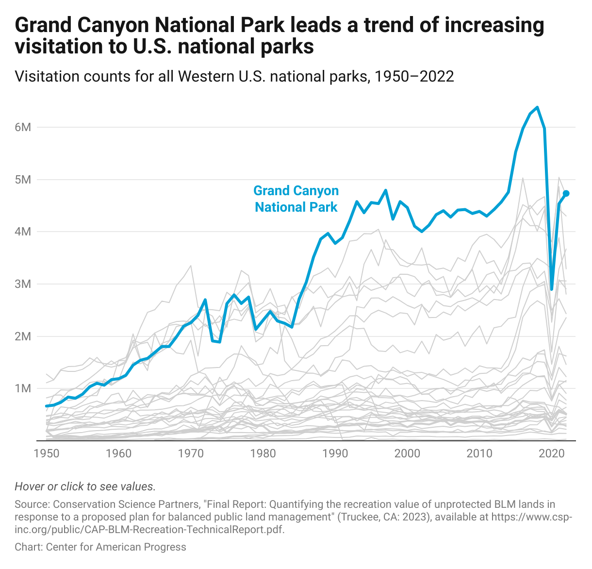
Figure 3 from "Protecting Vulnerable Public Lands Could Address U.S. Outdoor Recreation Needs" (Drew McConville, Sam Zeno), 9/20/23.
Color scales
-
Color scales for choropleth maps, symbol maps, and heatmaps typically use dark-to-light ranges of color (aka color ramps) to indicate volume or concentration of value (e.g., dark blue for higher values, light blue for lower values) using a stepped (classed) or continuous (unclassed) scale. Divergent scales using two or more colors can create a greater range and a stronger contrast in values but should only be used when there is a clear dichotomy (e.g., positive/negative values or another established threshold).
-
If your data is classed (divided into distinct values or ranges) your color scale should be classed (shown in color steps) using discrete color values, either on a gradient scale (e.g., dark blue, medium blue, light blue, etc.) or using distinct, discrete colors (e.g. blue, green, red, purple, etc.).
-
If your data is unclassed (on a continuous scale) use a continuous color gradient, or you can convert your scale into discrete ranges (e.g., 1–10%, 10–20%, 20–30%, etc.) represented by discrete colors from a gradient scale.
-
Use a classed scale when trying to isolate a significant range or communicate statistical brackets. Use an unclassed scale to tell a more fluid, nuanced data story.
-
This Datawrapper blog article explains When to use classed and when to use unclassed color scales.
-
-
The type of interpolation you choose will determine how your data is mapped to your color scale and can have a profound impact on the appearance, clarity, and accuracy of your map and your story.
-
Choose a color interpolation method based on the distribution of your data. Linear interpolation may produce the clearest representation of evenly distributed data, whereas quantile, quintile, or natural interpolation may be better for data with a more skewed distribution and/or strong outliers.
-
When comparing two or more maps or charts, always apply the same color scale and interpolation to all.
-
This Datawrapper blog article explains How to choose an interpolation for your color scale.
-
CAP dataviz color palette
AXIS SCALES AND LABELING
Readability is a critical part of clarity in chart and graph design. If a chart is difficult to read, its chance of success is greatly diminished. Some common readability issues are: cramped text, or repetitive long text labels, diagonal and vertical text orientation, and irregular time scales.
Streamline text to eliminate unnecessary formality and redundancy. All chart text should be reduced to the minimum word count necessary to serve its purpose.
CAP standards and best practices for axis scales and labeling:
-
All chart text—axis labels, scales and categories, and annotations—should be oriented horizontally, not turned vertically or diagonally due to space considerations.
-
Y-axis label information should be included in the dek, not rotated next to the vertical axis.
-
Rare exceptions can be made for charts with a large number of discrete ordinal categories (e.g., U.S. presidents as a time scale) on the horizontal axis.
-
-
Large number values should be displayed in abbreviated terms (e.g., $24.1M, 3.1B, 347K, etc.) and never reduced with an “in thousands” or “in millions” multiplier.
-
Data should always be prepared and submitted with full, actual number values. Appropriate prefixes, suffixes, and abbreviations will be added when visualization is built (e.g., 427,000 or 427,391 would be displayed as 427K).
-
-
Consistent, equal intervals must be used for all quantitative scales, with a range set to accommodate the data, never to manipulate it.
-
The maximum value on a quantitative scale range should not exceed the largest value by more than one labeled interval, unless it’s a percentage with a range to 100%.
-
Avoid awkward intervals.
-
Quantitative-scale tick values should be whole numbers, even if the data is presented with one or more decimal places. Exceptions can be made for scales so small they require decimal places—typically less than two.
-
-
Discrete, categorical tick labels on column chart (horizontal) x-axes should be as concise and consistent as possible, center-aligned, and horizontally oriented.
-
If tick labels are lengthy, contain long words, or the chart has more than five categories, a horizontal bar chart should be used.
-
-
Quantitative y-axis (vertical) tick labels should be right-aligned, with consistent decimal places, in equal intervals, and with an appropriate prefix or suffix ($, %, etc.) on the top label only.
-
Y-axis label (axis title) should always be horizontally oriented—never turned vertically.
-
Y-axis label can be positioned above the axis, but metrics should be explained in the figure dek (subtitle/description).
-
[example series: vertical (no); left (okay); above (better); in the dek (best)]
-
-
Direct labeling of some or all categories (e.g., lines in a line chart and dots in a Scatterplot) on the chart grid generally increases readability and eliminates most of the cognitive load of labeling using a color key.
-
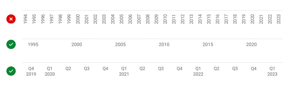
Time scales: X-axis time scales should run left to right in chronological order with equidistant intervals.
-
If the time span is too great to label every day, month, or year comfortably, larger intervals should be used.
-
Unlabeled tick marks can help the reader track intervening time units.
-
-
Date format: Time scale labeling should use the clearest, most appropriate, and easiest-to-understand date format.
-
Remove unnecessary labeling (e.g., remove days or months from a span of years)
-
Table column headers must be brief—ideally no more than 5 words—and may use common abbreviations to reduce visual noise and improve readability (e.g., % in place of “percentage” or FBI in place of “Federal Bureau of Investigation”).
-
Acronyms that are not universally familiar (e.g., CFPB or EPOP) should be spelled out in the figure dek or in a note below.
-
-
Tooltips are small callouts that appear when users hover over or click on a visual element (e.g., a dot on a map or a scatterplot or a point on a line in a line chart).
-
Use tooltips to provide relevant and useful details and/or to reduce cluttered labeling by providing identification when interacted with (e.g., the location of a point or area on a map).
-
Tooltip information must be concise and never substantial enough to create a vertical or horizontal scroll.
-
Tooltip values should be added to the figure spreadsheet as independent columns.
-
HED, DEK, AND FOOTER
One of the most overlooked and undervalued aspects of data visualization is supporting language. How the title (hed), subtitle/description (dek), notes, and source are handled can make or break a visualization.
CAP standards and best practices for hed, dek, and supporting text:
-
The hed (aka title) should clearly and concisely state the primary takeaway of your visualization. Don’t “hide the ball” or rely on the visualization alone to deliver the finding.
-
A clever title might stimulate interest, but it can also diminish odds of success if it fails to reinforce the message.
-
Unless your target audience is a narrow slice of domain experts, avoid jargon and uncommon acronyms and use plain language.
-
-
The dek (aka description) should describe the data, basic methodology, and metrics being used in the visualization. State clearly what needs to be understood about the x- and y-axes including units of measurement (e.g., people, jobs, dollars, percentage, or percentage-point change) and parameters of the content (e.g., population, timeframe, criteria). Ambiguity about the premise of the visualization will almost always render it ineffective.
-
All data visualizations must have a credible source(s) detailed in a citation, formatted to CAP style, with a working link to source material, whenever possible.
-
Lengthy citations with multiple sources should reside in a PDF file or on a standalone webpage, which can be linked to from the visualization source note.
-
-
Notes should be used to:
-
Clarify methodology. Often the dek is insufficient to explain how the data was formulated or what the chart/map is depicting, but try not to overwhelm the visualization with small text.
-
Extensive, detailed methodologies and sources should reside in a PDF file or on a standalone webpage, which can be linked to from a visualization note.
-
-
-
Provide critical user instructions. Without a note, readers might not be aware that a visualization has interactivity or how to engage with it (e.g., hover or click to see values).
-
Provide asterisk information. Notes can help to eliminate clutter in the visualization by moving important context information into an asterisk (*) note below.
ANNOTATION
Annotation can provide important context and curation for the reader. It can be text notes in the plot area directing attention to critical points, or it can be graphical elements such as lines, arrows, or shaded areas, steering the reader’s attention or providing useful context for the data.
CAP standards and best practices for annotations:
-
Text annotations should be as concise as possible, horizontally oriented, and slightly distinguished from label text (e.g., in italics or color).
-
Reference lines(e.g., reflecting median value) must be clearly distinguished from data, grid, and axis lines. This can be achieved by adjusting line weight, line dashes, and line color or opacity. Reference lines must also be clearly labeled.
-
Shaded areas can be used to frame or contextualize data. With few exceptions, shading should be gray with low opacity in order not to obscure or compete with chart and data elements.
-
Recession bands are recommended for economic time series graphs or to identify important spans of time—not just recessions.
-
Shading can be used to emphasize the gap between lines in a line chart.
-
-
Tooltips can be used to provide relevant and useful information.
-
Tooltip information must be concise and never substantial enough to create a vertical or horizontal scroll.
-
Tooltip values should be added to the figure spreadsheet as independent columns.
-
EQUITY AND BIAS
Even data visualizers with the best of intentions can inadvertently display information in a way that undermines equity and/or reinforces harmful bias and stereotypes. Awareness of these pitfalls is the first step toward avoiding them in our work.
It’s also important to remember that bias can be baked into the data, which may require mitigation during the visualization process or necessitate a search for more accurate, detailed, and/or representative data.
CAP standards and best practices for fostering diversity, equity, and inclusion and mitigating bias in our data visualization work:
-
Avoid arbitrary sorting of categories. It is less intuitive and susceptible to bias. Always sort bars in bar charts, segments in Stacked bar charts, and rows and columns in tables in a purposeful way that best serves your audience and goals: chronologically, by descending or ascending values, or alphabetically—or by some other methodology that serves your argument.
-
Recognize and resist ingrained patterns like listing “white” and “men” first, suggesting they are the most important population or the default that other populations should be measured against.
-
-
Avoid implicit bias in color selection.
-
Avoid color connotations that have negative and/or stereotyped demographic or gender associations (e.g., people of color being arbitrarily assigned darker colors, Native American/Indian people being coded as red or Asian people being coded as yellow, or male/female being coded as blue/pink).
-
Let message, methodology, and design principles guide color scale values and application. For instance, if darker shades are used to represent a greater degree of an undesirable condition, that association should be made purposefully, not arbitrarily. Such associations should be based on: 1) the intended focus of the visualization (e.g., an undesirable condition); and 2) what color/shade will create the starkest contrast, based on the default background color (e.g., dark shade on a light/white background).
If the focus is on a desirable condition, the same dark shade should be used—assuming it is displayed on a light/white background. If the default background is dark/black, light shades should be used to direct focus to values representing the desirable or undesirable conditions.
-
-
When possible, try to disaggregate demographic data. Aggregating broad racial or ethnic groups, such as “Asian” or “Hispanic,” often obscures the true story of populations swallowed up by a conventional label.
-
Craft language with a racial equity awareness. Use people-first language, such as “people with disabilities” rather than “disabled people.” Terms should also refer to people and not strictly to their skin color—for example, “Black people” not “Black.” Labels are often baked into the data, creating a dilemma for visualizers who may wish to adjust them due to concerns around equity or representation.
-
Avoid axis labels such as “more poverty” or “more Black” in favor of more people-oriented language such as "larger proportion of people experiencing poverty" and "larger Black population"
-
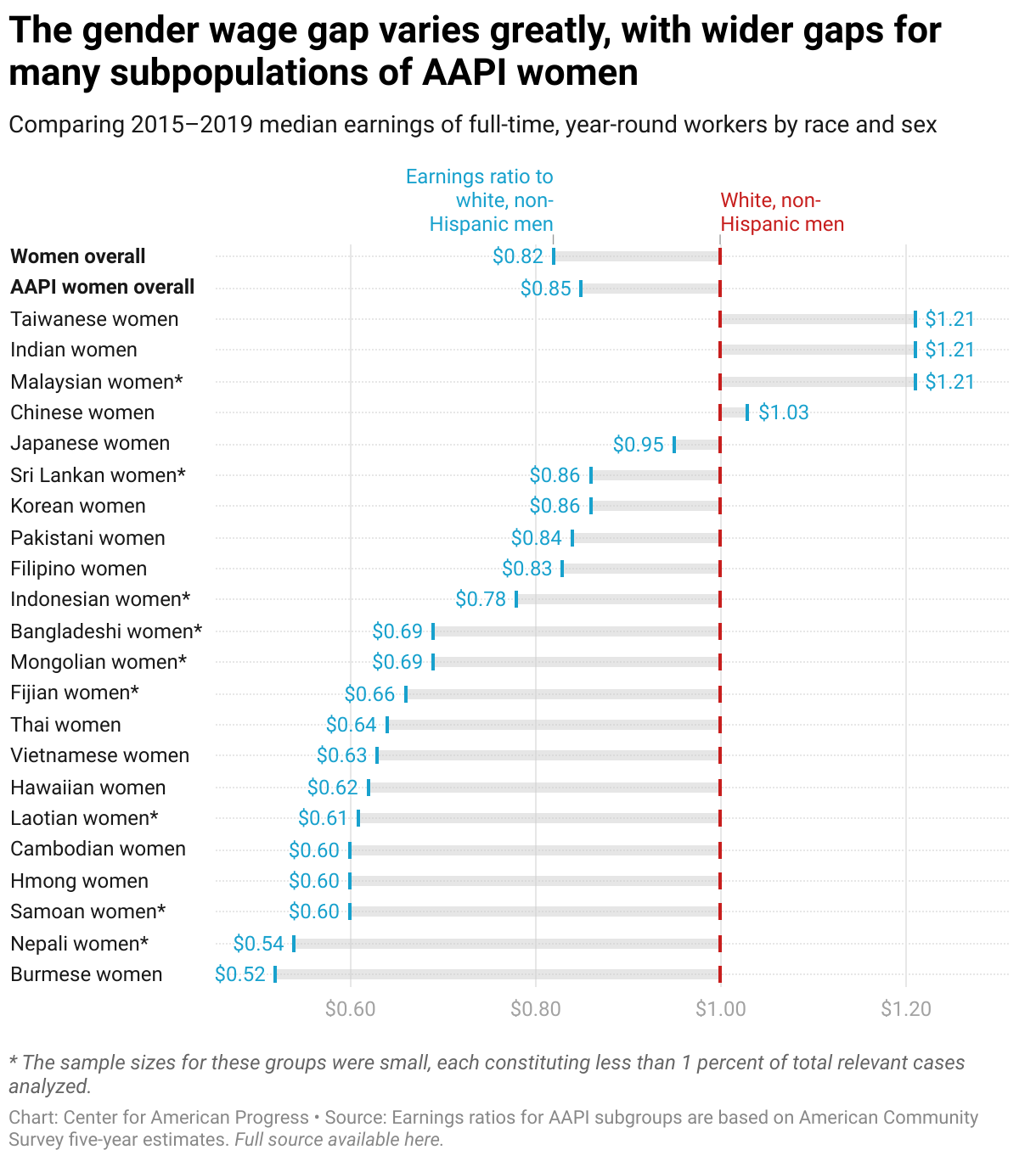
Figure 2 from "Women of Color and the Wage Gap" (Robin Bleiweis, Jocelyn Frye, Rose Khattar), 11/17/21.
RESOURCES
How to choose a chart type
Whether you’re demonstrating a trend over time, suggesting a relationship between two variables, breaking down an aggregated total into proportional parts, illustrating a geographic pattern, or doing two or more of these things, you’re telling a data story.
Telling a clear, accurate, and effective data story begins with identifying what sort of data story you’re trying to tell. The Financial Times graphic team developed a list of nine data story types that can be useful for the first step: choosing a chart type.
|
DATA STORY TYPE |
CHART TYPE |
|
Comparison of magnitude |
● Bar/column chart*
|
|
Change over time |
● Line chart*
|
|
Part-to-whole |
● Stacked bar chart*
|
|
Correlation |
● Scatter/bubble plot*
|
|
Ranking |
● Bump chart*
|
|
Flow |
● Sankey diagram*
|
|
Distribution |
● Histogram*
|
|
Deviation |
● Range/gap chart*
|
|
Geospatial |
● Map*
|
*Most common and reliable option.
Figure submission checklist
-
Figures are submitted in an Excel file (no Sharepoint or Google Sheets links), emailed to Editorial Core and Art Team.
-
Each figure is on its own tab, labeled with a consecutive figure or table number (e.g., “Figure 1,” “Figure 2,” “Table 1,” “Figure 3,” “Table 2,” “Table 3,” etc.).
-
Multichart figures are labeled “Figure 2a” and “Figure 2b” on the designated tab (e.g., “Figure 2”).
-
Each tab includes the following information (bold = required):
- Figure #
- Hed
- Dek (required for all charts)
- Type (e.g., line chart, table, map, diagram, etc.)
- Data
- Example chart or image
- Note
- Source
- Alt text
- Annotation to be added
- Internal note for Editorial and/or Art formatted this way: XX NOTE: [CONTENT] XX
-
All unnecessary tabs and extraneous information are deleted.
-
Data are delivered in full, actual number values, with as many decimal places as possible, and never using a multiplier like “in thousands” or “in millions.” Designers will abbreviate large numbers and/or adjust the number of decimal places according to CAP standards and best practices (e.g., $4.1B, 13.2M, 275K, 1.65%).
-
Data are in hard values, with formulas removed (Excel > Select/Copy > Paste Special > Values).
-
Time series dates are in a column, not a row, and are recognized as date values in Excel.
-
Map locations, such as cities or towns include latitude and longitude coordinates—each in their own column—and GeoJSON file(s) are provided for any special geographic areas, including national parks, land tracts, and/or ocean areas that need to be featured.
-
Tooltip values are added to the figure spreadsheet in individual columns.
For more on submitting figures to Production, please visit the CAPNet page on the subject
FAQ
Do I need to adhere to all standards and best practices when submitting figure data and chart examples to Production?
No. Authors should have awareness of the CAP standards and best practices and align their requests and expectations accordingly; but they will not be expected to apply every piece of guidance to figure data and examples submitted to Production prior to publication.
The Art and broader Production team will ensure that CAP’s organizational standards and best practices are applied to all published data visualization work and, when necessary, provide guidance to policy team authors on how to bring work into compliance.
That said, having awareness of the figure submission recommendations will result in a smoother, more efficient figure design process.
What if I want to do something that is advised against in this guide?
The standards and best practices in this guide will be applied and upheld understanding that there may occasionally be exceptions that will better serve the higher-order principles. As a living document, it is expected to be regularly reevaluated, refined, and updated. Recommendations for improvement are welcome, and the Art team is always happy to entertain and discuss alternative perspectives and approaches.
How should I submit a request for figures to Production?
See the Figure submission checklist section of this document, and visit the CAPNet page for more information.
What is the difference between “percent change” and “percentage-point change”?
Percentage points can be used to describe the difference between two percentages. Percent change can be used to describe how much a value has changed relative to a previous number. For instance, if a value changed from 8% to 10% that would be a two percentage-point increase, or an increase of 25%. It is not a 2% increase. To calculate percent change, subtract the previous number from the current number to get the difference (10 - 8 = 2) then divide the difference by the previous number (2 ÷ 8 = 0.25) and multiply by 100 to convert to a percentage number (0.25 x 100 = 25%).
What is the difference between a chart and a graph?
“Chart” is a broad, catchall term for the graphical representation of data. It includes tables, graphs, and diagrams. A “graph” is a class of chart that specifically plots data along two dimensions (e.g., a line graph).
Many chart types are known by multiple names or designations (e.g., chart, graph, plot, diagram, etc.). The authors of this guide have made an editorial decision to use “chart” to describe chart types that don’t have a clear consensus designation and also for consistency (e.g., “line chart” will be used to refer to line graphs).
SOURCES AND REFERENCE
BOOKS
Data Visualization Handbook
Juuso Koponen, Jonatan Hildén
The Wall Street Journal Guide to Information Graphics
Dona M. Wong
Data Points
Nathan Yau
Data Feminism
Catherine D'Ignazio, Lauren F. Klein
The Functional Art
Alberto Cairo
The Truthful Art
Alberto Cairo
How Charts Lie
Alberto Cairo
Information Visualization: Perception for Design
Colin Ware
Fundamentals of Data Visualization: A Primer on Making Informative and Compelling Figures
Claus O. Wilke
Hands-On Data Visualization: Interactive Storytelling from Spreadsheets to Code
Jack Dougherty, Ilya Ilyankou
TOOLS AND TRAINING
Datawrapper
The
Datawrapper Academy
The
Financial Times Visual Vocabulary
Cleaning Data in Excel
Maarten Lambrechts
Data Visualization Glossary
Alok Pepakayala
ARTICLES
Datawrapper Blog
Lisa Charlotte Muth (and others)
"How to choose an interpolation for your color scale"
Lisa Charlotte Muth | Datawrapper Blog
"When to use classed and when to use unclassed color scales"
Lisa Charlotte Muth | Datawrapper Blog
“Why not to use two axes, and what to use instead”
Lisa Charlotte Muth | Datawrapper Blog
Truncating the Y-Axis: Threat or Menace?
Michael Correll, Enrico Bertini, Steven Franconeri
"Dual-Scaled Axes in Graphs, Are They Ever The Best Solution?"
Stephen Few
"Do No Harm Guide: Applying Equity Awareness in Data Visualization"
Jonathan Schwabish, Alice Feng